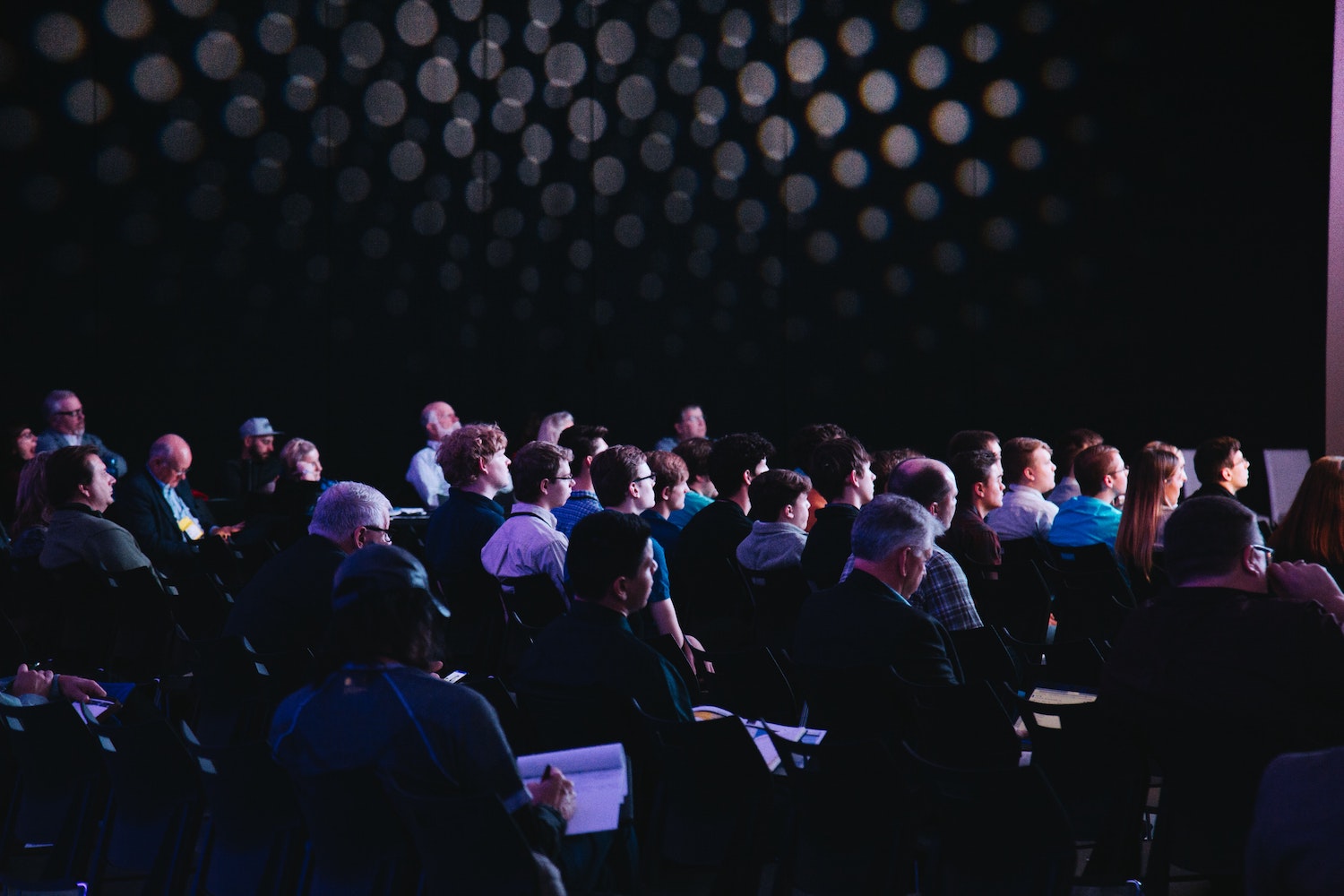
So, you’re managing to drive traffic to your event signup page. Great work, but what’s next?
Well, if this traffic is failing to convert into genuine signups, it’s probably time to reassess the optimisation of your event page. After all, it can take a lot of time, effort and money to drive users to your site – so losing conversion opportunities due to a poorly constructed landing page is the ultimate cardinal sin of any event marketer.
Luckily, we’re here to save the day, sharing six key elements of an event signup page that’s primed to convert visitors every time.
Date, time and location details
Sure, this one seems obvious, but you’d be surprised how easy it is to forget the basics sometimes. With this in mind, start by ensuring the fundamentals – the date, time and location of your event – are clearly presented on your event page.
The user shouldn’t have to work to find this information. On the contrary, they should be able to find these basic details from a single glance at your event page. Look to create a flawless user experience by considering your page design, ensuring fundamental event information is displayed clearly towards the top of your landing page and is readily distinguishable from the rest of your page content.
An eye-catching headline
Once you’ve got users landing on your event page, the next step is to keep visitors on your event page. After all, the longer a user spends on your page, the more likely they are to convert.
So, how do you keep your visitor’s attention? An eye-catching headline, of course! For best results, take the time to get to know your audience: what demographic do they fall into, what are their interests, and why are they considering your event?
This allows you to become more direct in your headline and, in turn, increases your likelihood of capturing the user’s attention. Use second-person pronouns to speak directly to the visitor, taking time to carefully consider your headline style and language choices based on your audience research.
A comprehensive event summary
Remember that the purpose of your event page is to drive conversions, meaning every piece of content on your page should provide real value that encourages signups.
Try to avoid the use of filler content wherever possible. Remain sharp and to-the-point, asking yourself if each line is providing the user with new and important information about your event. If it isn’t, consider whether you’re using your word count to maximum effect.
This event summary should also look to tie your brand and event together. After all, you want attendees to associate your event with your brand in order to expand your customer base and better establish your brand as a key name in your sector. Ensure all content is in line with your brand voice as well as your visual branding across your on-page content and page design.
A clear incentive to convert
What makes your event so special? Why should anyone care? How will attendees benefit from signing up?
These are all questions that should be answered when presenting the user with a clear incentive to convert. If you’ve carried out your audience research, this should be a whole lot easier – as it’s likely you already have a solid understanding of what your attendees are looking to get from your event.
Either way, make sure you’re making a big ol’ song and dance out of any unique selling point (USP) your event boasts. Whether it’s a noteworthy guest speaker or access to exclusive material, make it crystal clear that your event is not one to be missed.
An irresistible call-to-action
With your visitor hooked, it’s now time to reel them in – and no bait works better than an irresistible call-to-action (CTA).
The recipe for a killer CTA is simple: keep it short and effective. To do this, communicate clearly and directly with the user, using strong imperatives such as ‘sign up now’ or ‘register today’. Of course, clicking this button should take the user to the most logical conversion point – whether that’s an event registration form or ticket purchasing platform.
Be sure to consider your page layout and design here, too. As the final driving force pushing the user towards a conversion, a CTA button should stand out against the rest of your content and should be positioned in a strategic place on the page.
A user-friendly signup form
After all that hard work, it’d be a real shame for your conversion to fall through at the last crucial moment.
So, be sure to create an event registration form that’s quick and easy to use. Look to collect the bare necessities when it comes to user info (think name, address and contact details). The reasoning here is simple – the quicker the form is to complete, the more likely the user is to complete it.
Make sure you haven’t forgotten about mobile users here, either. Forms should be adapted to function and display seamlessly on both desktop and mobile to guarantee a smooth user experience.
By optimising your event page with these key elements, you can engage users at each stage of the sales funnel. Those in the informational stage will be able to quickly acquire basic event info, while those closer to converting will be spurred on by your comprehensive, targeted content and strong CTAs.
Integrating these elements into your landing page is a sure-fire way to bolster conversion rates and see more signups than ever before. To learn more about how Six Circles can help you streamline your event marketing, get in touch with us today to book your free online demo of our community engagement platform.